
This is the reality on too many shop floors. Downtime gets logged after the fact. Quality drift surfaces once a batch is already scrapped. Bottlenecks only become visible once the whole line backs up.
The data problem runs deep. A 2025 survey reported by IndustryWeek found that 20% of manufacturers frequently made poor decisions simply because production data was unavailable, untrusted, or hard to reach.
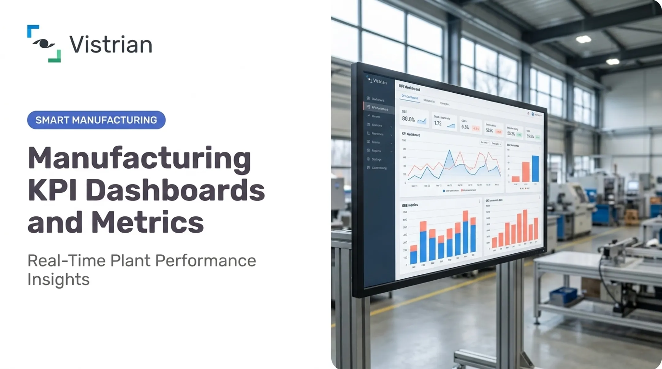
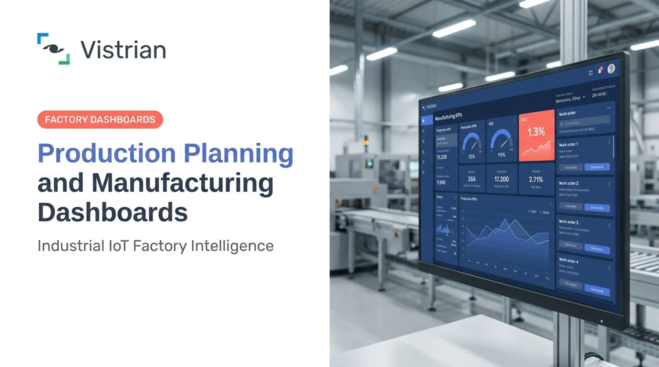
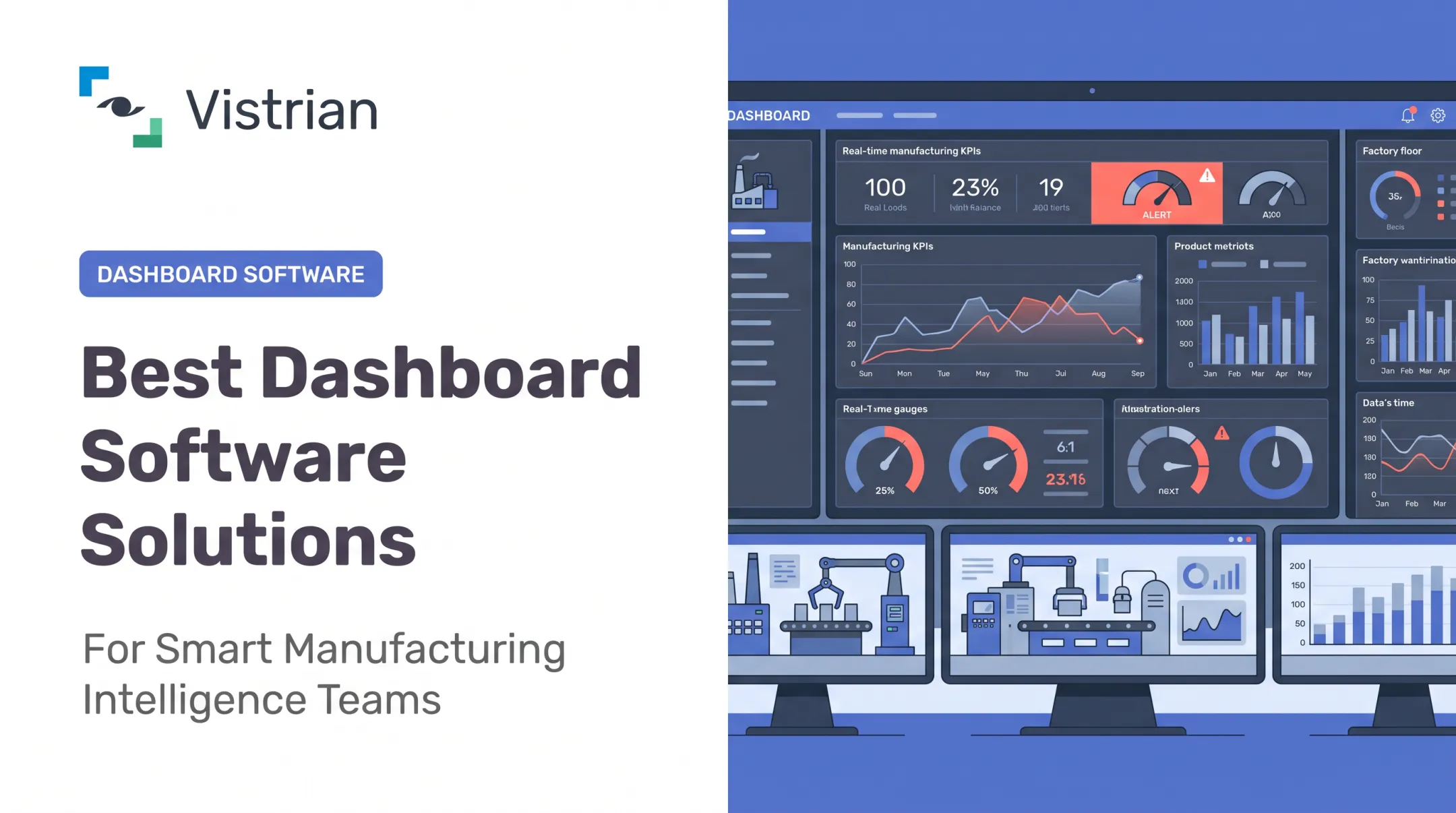
A real-time manufacturing dashboard closes that gap. It pulls live production data, machine status, quality readings, and downtime events into one visual view, so operators and supervisors can act while there's still time to fix something.
This guide covers the KPIs worth displaying, the dashboard types manufacturers actually use, design principles that keep dashboards useful rather than noisy, and the steps for connecting equipment and rolling one out on a US production floor.
Key Takeaways
- Real-time dashboards show the floor right now; historical reports explain why losses keep recurring.
- Every KPI on screen should map to a decision, an owner, and a response.
- Operators, supervisors, maintenance, quality, and leadership need role-specific views on shared data.
- Successful rollouts connect existing machines, standardize KPIs, and drill from alert to root cause.
What Are Real-Time Manufacturing Dashboards and Why Do They Matter?
A real-time manufacturing dashboard is a visual interface that displays near-real-time production, equipment, process, and quality data pulled from PLCs, machine controllers, SCADA, MES, ERP, databases, IIoT sensors, and operator entries. Instead of waiting for a shift-end summary, teams see line status, output, and exceptions as they happen.
Three layers often get confused:
- Dashboard: the live view that supports immediate awareness and action.
- Report: a periodic summary generated for review after the fact.
- Historian: the database that stores process, alarm, and event history for long-term analysis.
A dashboard can pull from a historian, but it isn't one—and it isn't a substitute for the trend analysis a historian supports. That distinction matters most on plants still stuck without any live view at all.
From Spreadsheet to Shared Screen
Many plants still run on whiteboards, disconnected spreadsheets, and verbal handoffs between shifts. That works fine until the person who knows why the line stopped clocks out. A shared dashboard replaces that tribal knowledge with one view of target attainment, downtime, and quality that every shift sees the moment they walk in.
Plant managers often get production numbers only at shift end, quality reports hours after defects occur, and equipment problems only after a machine has already stopped. Dashboards built on near-real-time data collection—such as Vistrian's FactoryLOOK—close that lag by surfacing line performance, equipment status, and bottleneck locations as they develop.
The payoff shows up in broader industry data too. Deloitte's 2025 Smart Manufacturing and Operations Survey of 600 executives found average net improvements of 10-20% in production output and 10-15% in unlocked capacity after implementing connected, data-driven operations programs.
That is a smart-manufacturing-program result, not a dashboard-only guarantee. Still, it points the same way: better visibility correlates with better output.
A good dashboard supports one decision chain:
- Detect an abnormal condition
- Identify the affected machine or process
- Route it to the right person
- Confirm whether the fix worked
Skip any of those four steps and the dashboard becomes decoration. One universal view rarely works either. An operator needs to know what to do in the next five minutes; a plant manager needs to know which line dragged down the week. Both should work from the same underlying data, filtered to the decision each person makes.

The Production KPIs to Display on a Real-Time Dashboard
Every KPI on a dashboard should earn its spot. Ask one question before adding any metric: does it help a specific person spot a loss, make a call, trigger an action, or confirm a fix worked? If not, it's clutter competing for attention.
Core Output and Schedule Metrics
These are the numbers operators and supervisors check constantly:
- Planned vs. actual output: shows whether the line is on pace; supervisors escalate when the gap widens.
- Production rate and cycle time: actual pace measured against takt time, the pace customer demand requires.
- Shift progress: target remaining versus time left in the shift.
- Schedule attainment: the percentage of planned output actually achieved within the period.
- Work-in-progress (WIP): flags where material is piling up between stations.
- Line or machine status: running, idle, or down, at a glance.
OEE: The Three Numbers Behind the One Score
OEE (Overall Equipment Effectiveness) multiplies three components: Availability × Performance × Quality. Showing only the final OEE number tells a supervisor something's wrong without saying what.
| Component | What It Measures | Typical Response |
|---|---|---|
| Availability | Run time vs. scheduled time | Investigate stoppages, changeovers |
| Performance | Actual speed vs. target speed | Check for minor stops, slow cycles |
| Quality | Good units vs. total units made | Route to quality for containment |

Breaking OEE down by machine, shift, product, or loss category, where the data is reliable, turns a single score into a diagnostic tool instead of a scoreboard.
Downtime, Quality, and Maintenance Signals
Downtime tracking should separate planned downtime (scheduled pauses) from unplanned downtime (unexpected stops). Both count as availability losses, but they call for different fixes: one is a scheduling question, the other a maintenance one. Pair downtime data with reason codes, top loss causes, and time since the last stoppage.
Quality metrics worth displaying:
- Defects, scrap, and rework
- First-pass yield
- Process deviations and quality holds
First-pass yield catches drift before it spreads across a whole batch. Vistrian's real-time SPC tools, for example, flag process drift toward specification limits and can hold non-conforming parts before they advance to the next station.
Maintenance indicators round this out:
- Open work requests
- Mean time between failures (MTBF)
- Mean time to repair (MTTR)
- Overdue preventive maintenance
These are trend indicators, not one-time snapshots. A single MTTR reading tells you little; an MTTR trend climbing over three weeks tells you a machine needs attention before it fails again.
Balancing Leading and Lagging Indicators
Lagging indicators, like completed output, OEE, and scrap, confirm what already happened. Leading indicators, like rising cycle time or growing WIP, warn you before the damage shows up in the lagging numbers.
ASCM points out that leading KPIs enable earlier course correction, citing a case where a rising clean-order rate predicted improved delivery reliability months before it appeared in the final metric. A dashboard needs both: leading indicators to catch problems early, lagging indicators to confirm whether the fix actually worked.
Types of Real-Time Manufacturing Dashboards for Production
Different roles need different dashboards, even when they pull from the same data.
Production and Andon Dashboards
Built for operators and line supervisors, these focus on a clear next action—not a wall of numbers. Typical views include:
- Current line status and shift progress
- Planned vs. actual output
- Active stoppages and escalation status
Andon-style alerts let an operator flag a problem the moment it happens instead of waiting for a supervisor's next walk-through.
OEE and Performance Dashboards
These display OEE alongside its availability, performance, and quality components. Users can then drill into the machine, shift, product, or loss category driving the result.
Vistrian Analytics builds that drill-down into its OEE views, so a supervisor can go from "OEE dropped 8%" to "changeover time on Line 3 doubled this shift" in a couple of clicks.
Downtime, Maintenance, and Quality Dashboards
Maintenance dashboards combine live stoppage events with reason codes, equipment condition, open work requests, and recurring-failure trends. That mix helps teams move from reacting to failures toward preventing them. Automated preventive-maintenance scheduling—triggered by usage, time, or real-time condition signals—supports the same shift.
Quality and process-control dashboards typically surface:
- Defects, scrap, and first-pass yield
- SPC exceptions with alerts tied to containment workflows
Catching a deviation before a full batch runs is often the difference between minor rework and a scrapped shift.
Plant Overview and Multi-Plant Dashboards
Plant managers don't need every machine signal; they need exceptions. A control-tower view uses status indicators and alerts to flag which line or department needs attention, without drowning leadership in raw data.

Multi-plant dashboards go one level higher. They compare standardized measures—OEE, output, downtime—across sites, while keeping enough local context to investigate why one plant's numbers differ from another's. Vistrian's modular, cloud-enabled Manufacturing Suite supports this centralized monitoring so operations leaders can compare facilities and still trace a problem back to its source.
Live views drive escalation and immediate intervention. Historical views support recurring-loss analysis, benchmarking, and capacity planning. A complete dashboard strategy needs both.
How to Implement and Design a Production Dashboard
A dashboard rollout that starts with software selection usually ends with a dashboard nobody uses. Start with the decision instead.
Start With the Decision, Not the Data
Run a short workshop with the people who'll actually use the dashboard. Document:
- The production decision you're trying to improve.
- Who makes that decision and how fast they need to make it.
- What data has to be visible to support it.
- What action should follow each alert.
Skipping this step is how plants end up with dashboards full of metrics nobody checks.
Connect Your Equipment and Data Sources
Audit what's already available: PLCs, SCADA, MES, ERP, historians, and manual entries. Mixed-vendor and legacy equipment is common on real production floors, not the exception.
- Use standard industrial protocols where machines support them.
- Pull from machine logs or databases when a direct connection isn't possible.
- Add IIoT sensors on equipment with no digital interface at all.
Vistrian's FactoryLOOK connects to controllers directly where it can and falls back to logs, databases, or added sensors where it can't. In one disk-media pilot, that approach kept data flowing continuously on equipment whose machine controller wasn't accessible at all—by reading sensor data alone.
Build the KPI Model Before You Design a Single Chart
For every metric, define its formula, source, unit, time window, target, owner, and how missing or conflicting data gets handled. Skip this and the word "downtime" ends up meaning something different on every line.
Design principles that matter once the KPI model is set:
- Put current status and target-vs-actual first; save deep detail for a drill-down.
- Use consistent colors for the same meaning across every screen.
- Show a timestamp so users know how fresh the data is.
- Make alerts visible without creating alarm fatigue.
Pilot, Then Scale
Test on one line before rolling out plant-wide. During the pilot, confirm three things:
- Numbers match what operators see on the floor
- Alerts trigger the right follow-up actions
- People change behavior when the dashboard flags a problem
Vistrian followed this path on an initial rollout of five tools across three processes on one line, validated with operators, then scaled to seven plants across four countries and more than 300 production tools monitored continuously.

Conclusion: Turn Production Data Into Faster Decisions
A real-time manufacturing dashboard shortens the distance between a production issue, an informed response, and a measurable fix—not another screen on the floor, but a faster path from signal to action.
The path that works, in practice:
- Choose decision-oriented KPIs, not vanity metrics.
- Tailor views to each role while keeping the underlying data consistent.
- Connect existing equipment, including the legacy machines everyone assumes can't be integrated.
- Govern KPI definitions so "downtime" means the same thing on every line.
- Pair live monitoring with historical analysis for recurring problems.
Vistrian's Manufacturing Suite—FactoryLOOK, Vistrian Dashboards, and Vistrian Analytics—plus the Maintenance Suite and Management Suite give manufacturers a way to build this visibility across a single line, a full plant, or multiple facilities. No suite guarantees a specific outcome on its own, but it removes the guesswork of learning about a problem after the shift ends.
If your team is still waiting for shift-end reports to find out what went wrong, it's time to look at what a real-time view could catch instead. Reach out to Vistrian to talk through what that would look like on your floor.
Frequently Asked Questions
What are the 5 KPIs for manufacturing?
Most production dashboards center on OEE, output/schedule attainment, downtime, cycle time, and first-pass yield. The right mix depends on your plant's goals; a fab watching tool qualification prioritizes differently than a packaging line watching cycle time.
What are the top 5 dashboard tools?
There's no universal ranking that holds up across industries. Compare tools on equipment connectivity, real-time data handling, alerting, scalability, and MES or ERP integration. Pilot on one line before you commit plant-wide.
What is dashboard making?
Dashboard making means choosing the right data, calculating KPIs correctly, and laying out visuals operators and managers can act on. It also covers alerts, drill-downs, source connections, and day-to-day validation with the people who will use it.
What are some good examples of dashboards?
Common types include production/Andon, OEE, downtime and maintenance, quality, plant overview, and multi-plant dashboards. Each supports a different decision, from an operator's next action to a plant manager's weekly review.