
Introduction
Walk onto most plant floors and you'll find production numbers on a whiteboard, quality data in a spreadsheet, downtime logged in the MES, and maintenance records living in a separate system entirely. Nobody has the full picture at the same time.
That fragmentation has real costs. Nearly 70% of manufacturers cite data problems, including quality, contextualization, and validation, as their biggest obstacle to using advanced analytics, according to Deloitte's 2025 Manufacturing Industry Outlook.
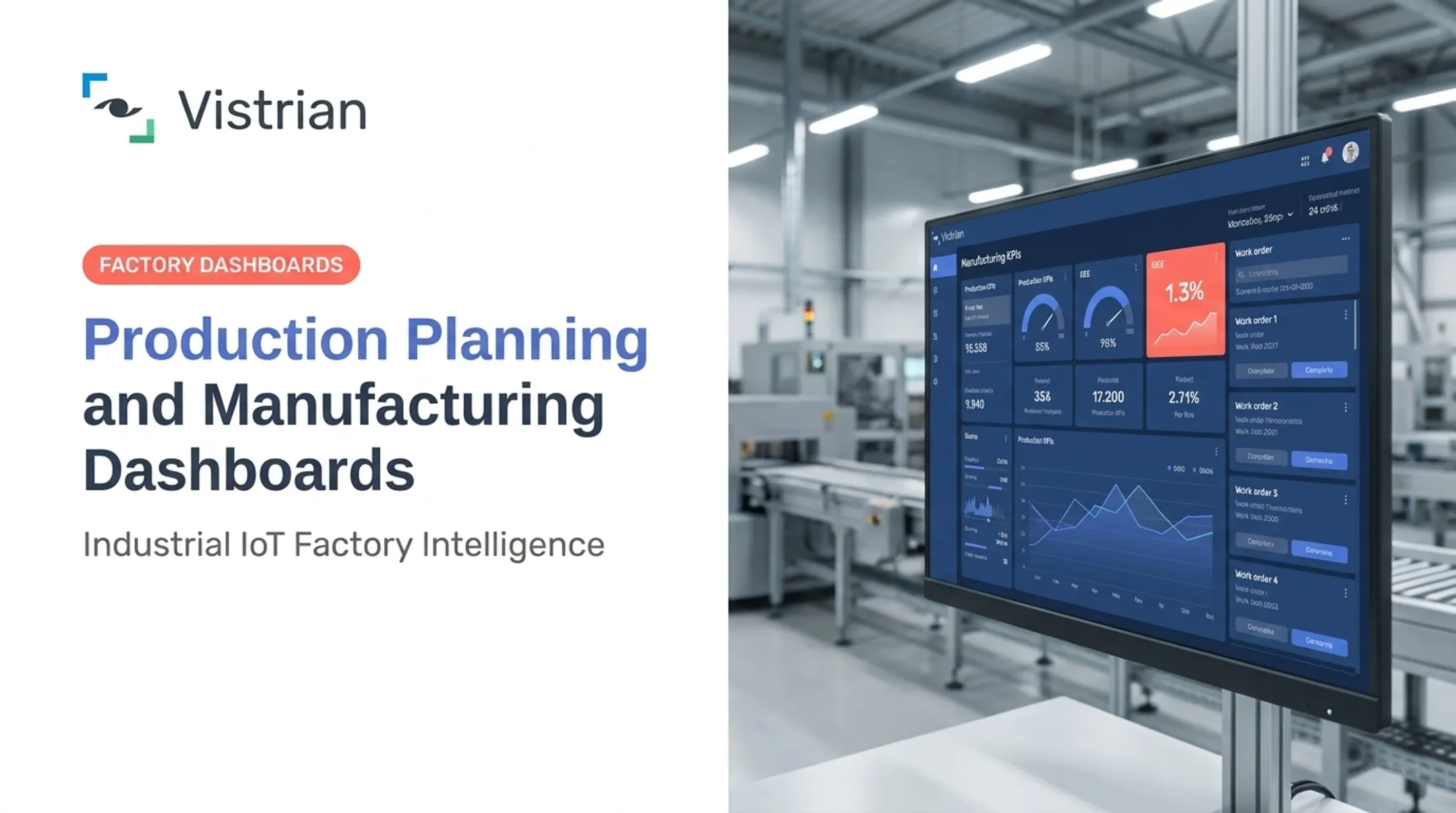
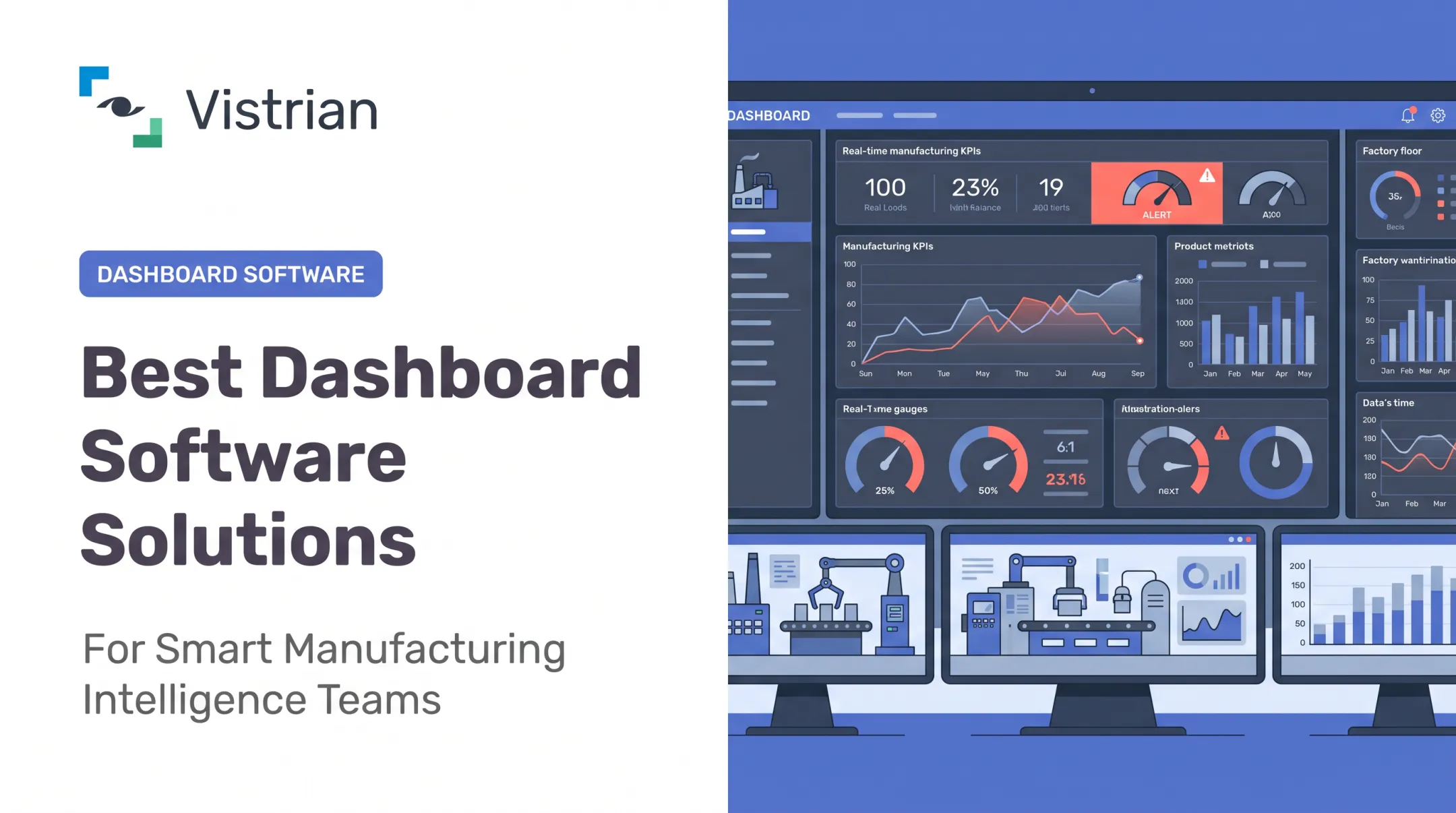
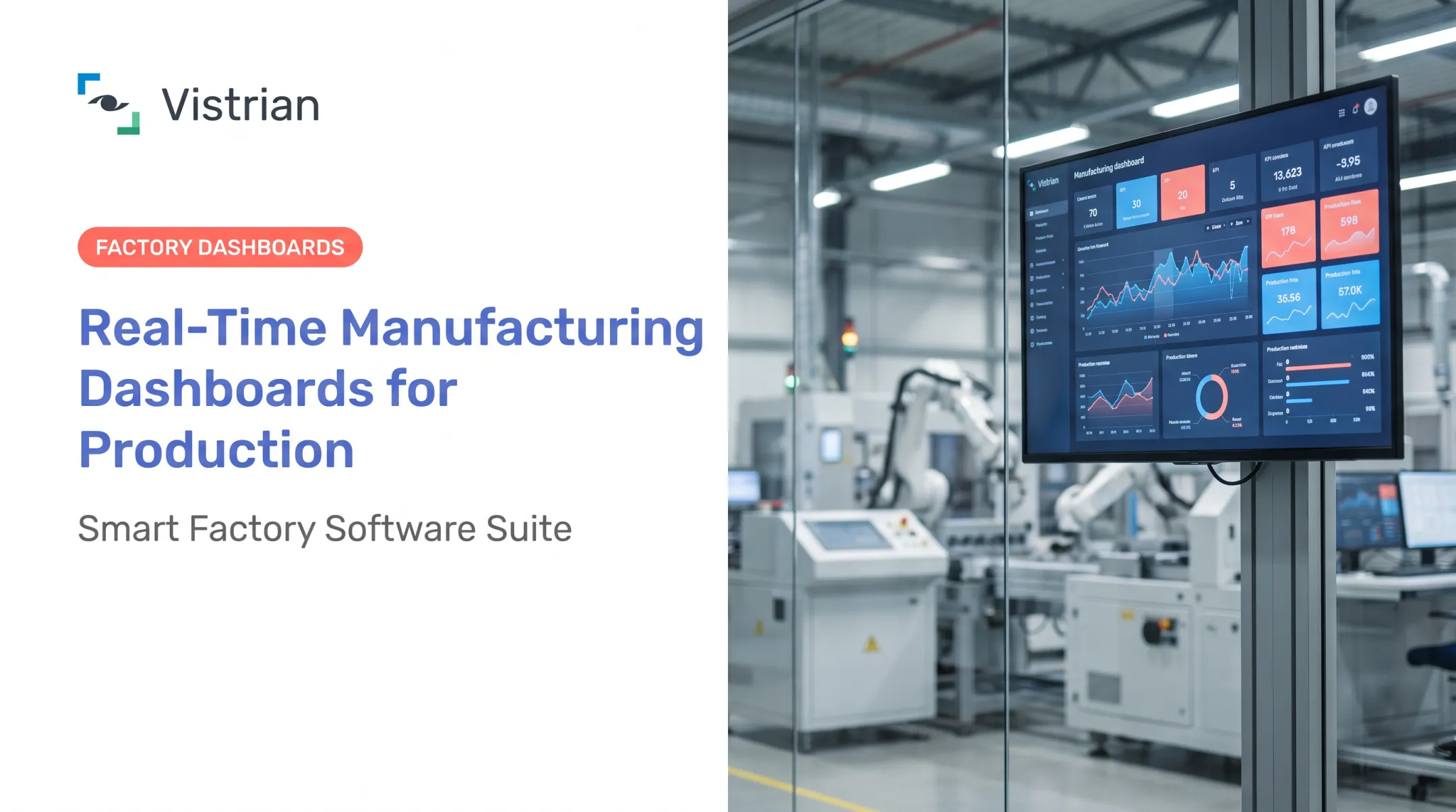
A manufacturing KPI dashboard solves this by pulling selected performance indicators into one visual, centralized view. It shows operators, engineers, and executives what needs attention right now instead of leaving it buried in last week's report.
This article covers:
- Which metric categories are worth tracking on the plant floor
- How dashboard design should shift by audience
- Data practices that make dashboards drive real decisions
Key Takeaways
- Track a focused set of KPIs tied to specific goals, not every metric available
- Build separate views for operators, plant teams, and executives at different refresh rates
- Pair outcome metrics like OEE and OTIF with diagnostic metrics that explain the "why"
- Give every KPI a clear owner, source, and escalation path when thresholds are breached
- Prioritize near-real-time data, including from legacy machines and IIoT sensors
Essential Manufacturing KPI Categories and Metrics
KPI selection should start with a question, not a spreadsheet template. Are you trying to improve output? Cut downtime? Protect quality? Control cost? Hit delivery dates? Reduce safety incidents? The answer determines which metrics actually matter.
Production and Equipment Performance
Overall Equipment Effectiveness (OEE) remains the anchor metric here. It's calculated as Good Pieces × Ideal Cycle Time ÷ Planned Production Time, and it rolls up three components: availability, performance, and quality, according to Vorne's OEE reference guide.
World-class OEE is often cited around 85% for discrete manufacturing. Vorne notes this figure comes from a collection of industry references rather than a single universal standard. Plants starting from scratch may see baselines closer to 60% or lower.
OEE alone doesn't tell you why a line is underperforming. Pair it with:
- Throughput and production attainment — actual output versus target
- Cycle time and changeover time — where speed loss occurs
- Capacity utilization — how much available capacity is actually used
For downtime, distinguish planned from unplanned events, then track downtime rate, mean time between failures (MTBF), and mean time to repair (MTTR). These loss categories turn a single OEE number into something an engineer can act on.

Quality and Yield
First-pass yield (FPY) measures the percentage of units that complete a process and meet quality requirements without scrap, rework, retest, or repair, per the ASQ Quality Glossary. Pair it with:
- Scrap rate and rework rate
- Defect rate, split by internal detection versus customer reject rate
- Right-first-time performance by process step
Separating internally caught defects from customer-reported failures matters. A plant with high scrap but zero customer returns has a different problem than one with low scrap but rising field complaints. Pareto charts and batch-level drill-downs help teams move from "yield dropped" to "why it dropped."
Maintenance, Cost, and Resource Efficiency
Maintenance metrics connect reliability to the bottom line. NIST reports that machinery-maintenance expenditures reached $57.3 billion across covered discrete-manufacturing sectors, with $119.1 billion in losses tied to preventable maintenance issues.
Plants in the top half for predictive-maintenance adoption saw 15% less downtime and 87% lower defect rates, according to NIST's manufacturing machinery maintenance research.
Track these alongside preventive maintenance compliance and planned-versus-unplanned maintenance ratios:
- Maintenance cost per unit
- Labor productivity
- Energy cost per unit
- Manufacturing cost per unit
One caution: cost metrics need consistent allocation rules. Don't compare cost per unit across two plants until product mix, reporting periods, and definitions actually line up.
Delivery, Inventory, Safety, and Enterprise Performance
These metrics connect the plant floor to customer and business outcomes:
- On-time delivery (OTIF) — orders received complete and on the agreed date
- Lead time and inventory turnover — how quickly materials move through the operation
- Work-in-process and supplier quality — inventory stuck in process and inbound defect risk
- Safety incidents — OSHA incidence rate: injuries × 200,000 ÷ employee hours worked
- Production volume variance — actual output versus the production plan
Executive dashboards can aggregate these across sites while still letting a manager drill down to a specific line, shift, order, or supplier when a number looks off.
Design Manufacturing KPI Dashboards for Different Audiences
No single dashboard serves everyone well. An operator needs to know what's happening on the line right now. An executive needs a trend across five plants over the past quarter. Trying to serve both with one screen usually satisfies neither.
Shop-Floor Dashboard for Operators and Supervisors
Keep this view simple and highly visible:
- Current machine or line status
- Shift output versus target
- Shift-level OEE
- Active downtime reason
- Quality alerts
Use large text, high contrast, and accessible colors with labels or icons, not color alone. Minimal scrolling. When a threshold is missed, the screen should indicate what action to take, not just flag a red number and leave the operator guessing.
Vistrian's FactoryLOOK applies this principle through role-based, multi-screen dashboards built for the shop floor. It surfaces cycle-time delays, rising vibration trends, or energy spikes, and points toward the likely cause rather than just displaying a chart.
Plant Operations Dashboard for Engineers and Managers
This audience needs more depth:
- Line-by-line OEE
- Downtime and alarm Pareto charts
- Cycle-time trends and changeover performance
- Quality losses and maintenance status
- Order progress by shift or product
The critical requirement is drill-down. A production manager needs total machine downtime and repair time, plus an OEE breakdown into availability, performance, and quality, as Vorne's OEE research notes for this role. If the dashboard can't take an engineer from "OEE dropped" to the specific machine, reason code, or batch involved, it's reporting, not investigating.
Executive and Multi-Plant Dashboard
Executives don't need every shop-floor alarm. They need trends, target variance, and cross-site comparisons across production attainment, quality, delivery, cost, and safety.
Vistrian's Management Suite consolidates plant data at this level while retaining consistent KPI definitions and filters for site, product family, and time period. This lets an operations leader compare OEE across facilities, spot which site is running best practices, and push those practices to underperforming plants.

Visual and Interaction Standards
Consistency across screens matters more than any single chart type. Use the same layout, naming convention, and status indicators everywhere:
- Show current value alongside target, prior period, and trend
- Assign a visible owner to each KPI
- Avoid decorative charts, unexplained colors, and misleading gauges
Turn Dashboard Metrics Into Manufacturing Action
A dashboard that just displays numbers is a report with extra colors. The value comes from connecting what you see to what you do next.
Pair Lagging Metrics With Diagnostic Ones
Missed production targets are a lagging outcome. The diagnostic layer explains why: downtime, speed loss, changeovers, staffing gaps, material shortages, or quality issues. One without the other leaves teams reacting to symptoms instead of causes.
Build an Action Workflow
For each priority KPI, define:
- Who monitors it — the role responsible for watching this number
- What threshold triggers attention — the specific value that demands action
- How it's investigated — the process for finding the root cause
- Where corrective actions are recorded — so fixes aren't lost
- When effectiveness is reviewed — closing the loop
This is where dashboards need to plug into existing routines, not replace them. Shift handovers, production meetings, maintenance reviews, and continuous-improvement events should all reference the same numbers the dashboard shows.
A real example: When North America's largest cocoa processor deployed FactoryLOOK, engineers used its Event and Alarm Pareto charts to compare a robotic packing line's behavior across shifts and days. That comparison identified concrete productivity fixes within days. The broader deployment was projected to save over $1 million in avoided capital expenditure with a 20%+ OEE improvement.
That kind of insight only holds when the conditions are comparable. Use trend lines and Pareto analysis to spot recurring losses, but skip comparisons across products, schedules, or operating conditions that aren't actually alike. A false comparison sends teams chasing the wrong fix.
How to Build and Implement a Reliable Manufacturing KPI Dashboard
Start With Goals, Users, and KPI Definitions
For every selected KPI, document:
- Business objective and metric owner
- Formula, unit, and target
- Reporting period
- The decision or action the metric should trigger
Limit the first release to the metrics needed for one defined use case or bottleneck. Expand only after users confirm the data is accurate and the dashboard is actually changing decisions.
Create a Trustworthy Data Foundation
Map each KPI to its source: PLCs, SCADA, MES, ERP, quality systems, maintenance software, or IIoT sensors. Before trusting any number on screen, check for:
- Gaps and duplicate records
- Missing timestamps
- Inconsistent downtime reason codes
An IIoT layer helps here by collecting data from older or unconnected equipment and normalizing it alongside modern machine data. This matters most in mixed-vendor plants where half the floor speaks a different protocol than the other half.
Select the Right Architecture and Refresh Rate
Not every dashboard needs to be labeled "real-time." Match refresh frequency to the decision:
- Shop-floor views: near-real-time for immediate response
- Engineering and plant management: hourly or shift-based reviews
- Executive views: daily, weekly, or monthly performance trends
Centralized, cloud-enabled analytics support multi-plant monitoring well, but they require appropriate access controls and integration testing before rollout.
Connect Legacy and Modern Equipment Without a Rip-and-Replace
Vistrian's Manufacturing Suite, including FactoryLOOK and Vistrian Analytics, is one example of this modular approach. It connects to machine controllers, logs, databases, and IIoT devices, regardless of equipment vendor or age, to feed dashboards, alerts, reporting, and root-cause analysis.
Vistrian Analytics tracks OEE, throughput, utilization, yield, and cycle time from machine-level to enterprise views. Because it works with legacy controllers as well as newer sensors, plants modernizing incrementally don't have to rip out existing equipment to get visibility.
Test, Govern, and Improve
Pilot the dashboard with real operators, engineers, and managers before wide rollout. Verify every KPI calculation against trusted records.
Then assign clear ownership for:
- KPI definitions and access permissions
- Target reviews on a set cadence
- Periodic removal of metrics that no longer support a decision
Dashboards that never get pruned tend to accumulate clutter nobody reads.
Frequently Asked Questions
What are the top KPIs to include on manufacturing KPI dashboards?
Most plants start with OEE, throughput, cycle time, downtime, first-pass yield, scrap rate, on-time delivery, maintenance compliance, cost per unit, and safety incidents. The exact list should match your plant's specific goals and bottlenecks.
What are examples of good manufacturing KPI dashboards?
A shop-floor dashboard shows current status and shift output for operators. A plant operations dashboard adds Pareto charts and drill-downs for engineers. An executive dashboard shows trends and cross-site comparisons for leadership.
How often should a manufacturing KPI dashboard update?
Shop-floor views typically need near-real-time updates since operators act within minutes. Plant management and executive views can use hourly, daily, or weekly refresh rates based on their decision timelines.
How do you choose the right manufacturing KPIs?
Start with a specific business goal or bottleneck, not a generic metric list. Assign each KPI an owner and a clear action, and drop any metric that users can't interpret or influence.
What data sources should feed a manufacturing KPI dashboard?
Pull from PLCs, SCADA, MES, ERP, quality systems, maintenance software, and IIoT sensors. Consistent definitions, accurate timestamps, and clear equipment identifiers matter more than the number of sources connected.